USER EXPERIENCE
I solve problems, design solutions and deliver engaging and lasting experiences.
Here's what I can do for you:
Ideation
User Research
Requirement Gathering
Persona Development
User Flows & Wireframes
Prototyping
Interaction Design
Heuristic Evaluations
Usability Testing
Microcopy
Design Systems
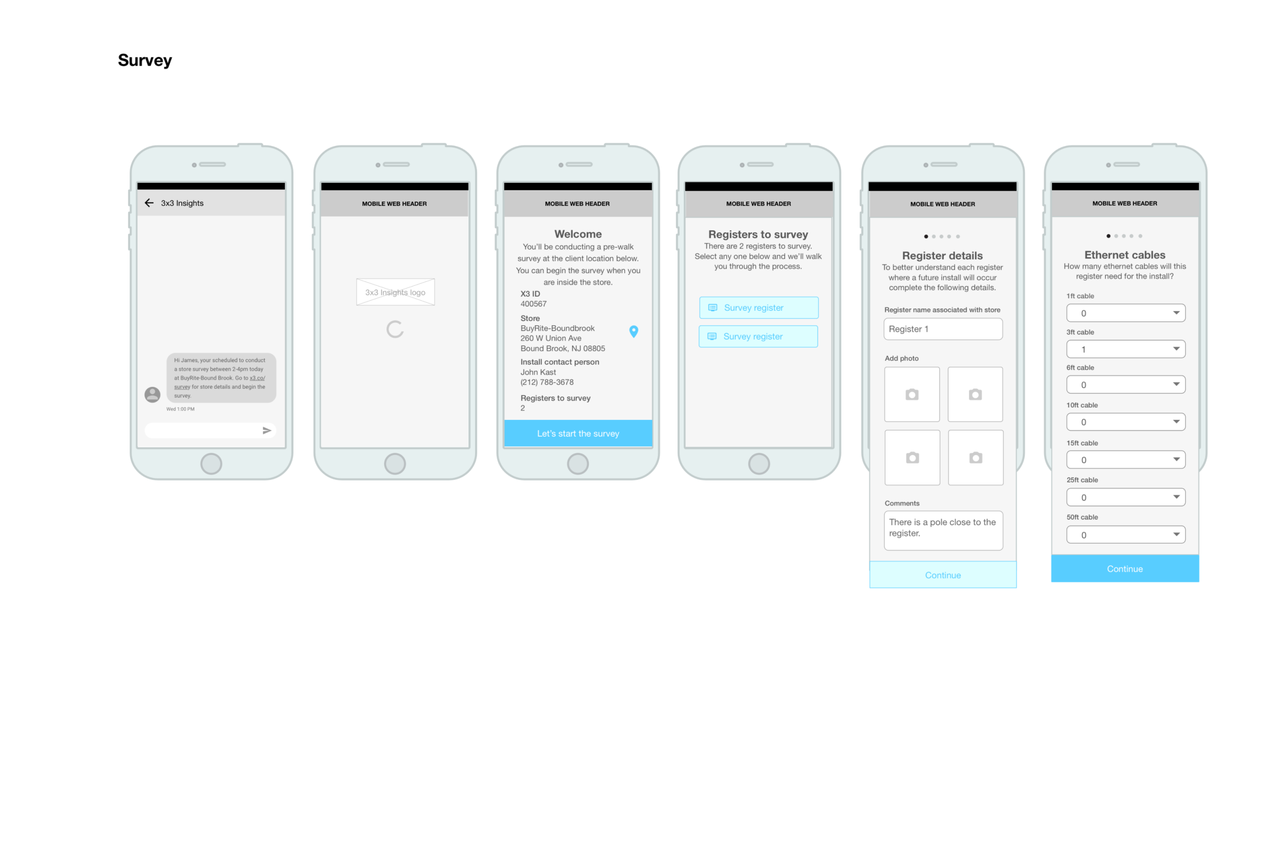
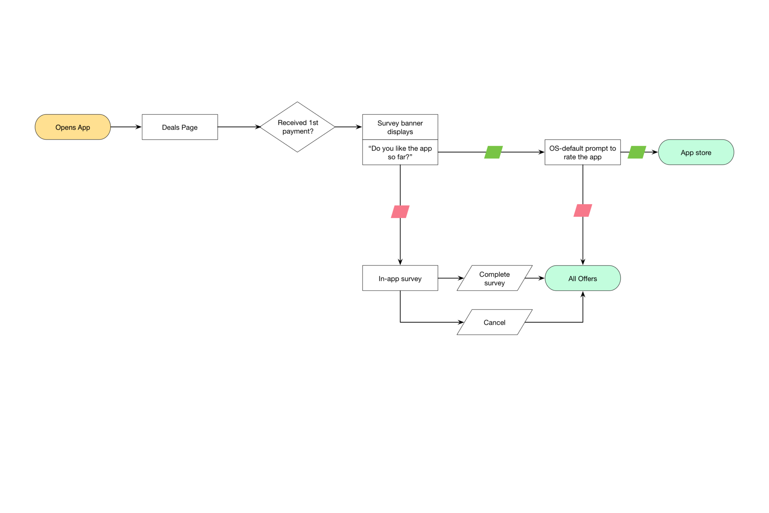
3x3
Role: UX Design
Analytics, CMS, Consumer Engagement, Web App
Improving profitability through analytics


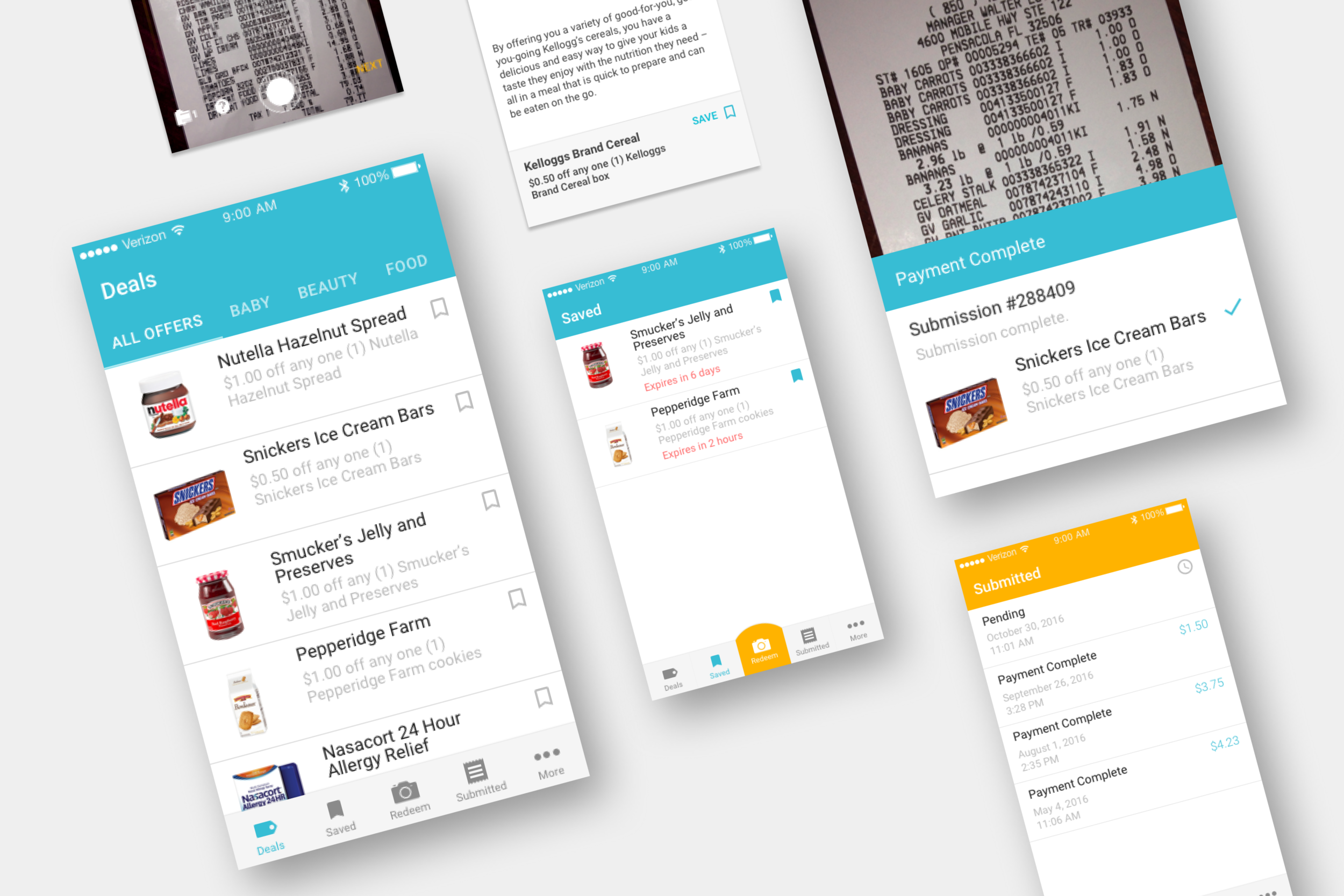
MobiSave
Role: UX/UI Design
Native Apps, Responsive Web, White Label, Email
Get cash back on grocery purchases


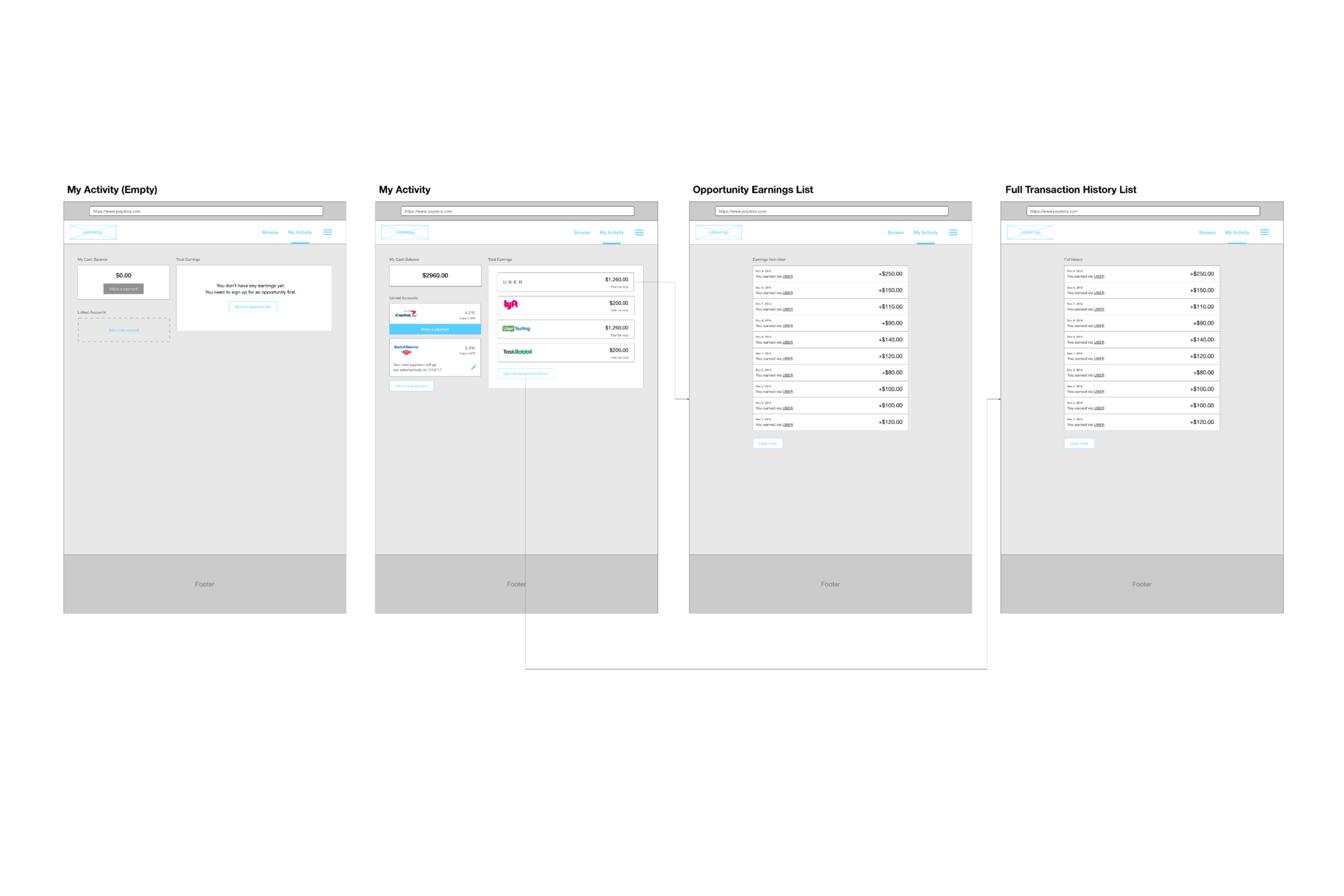
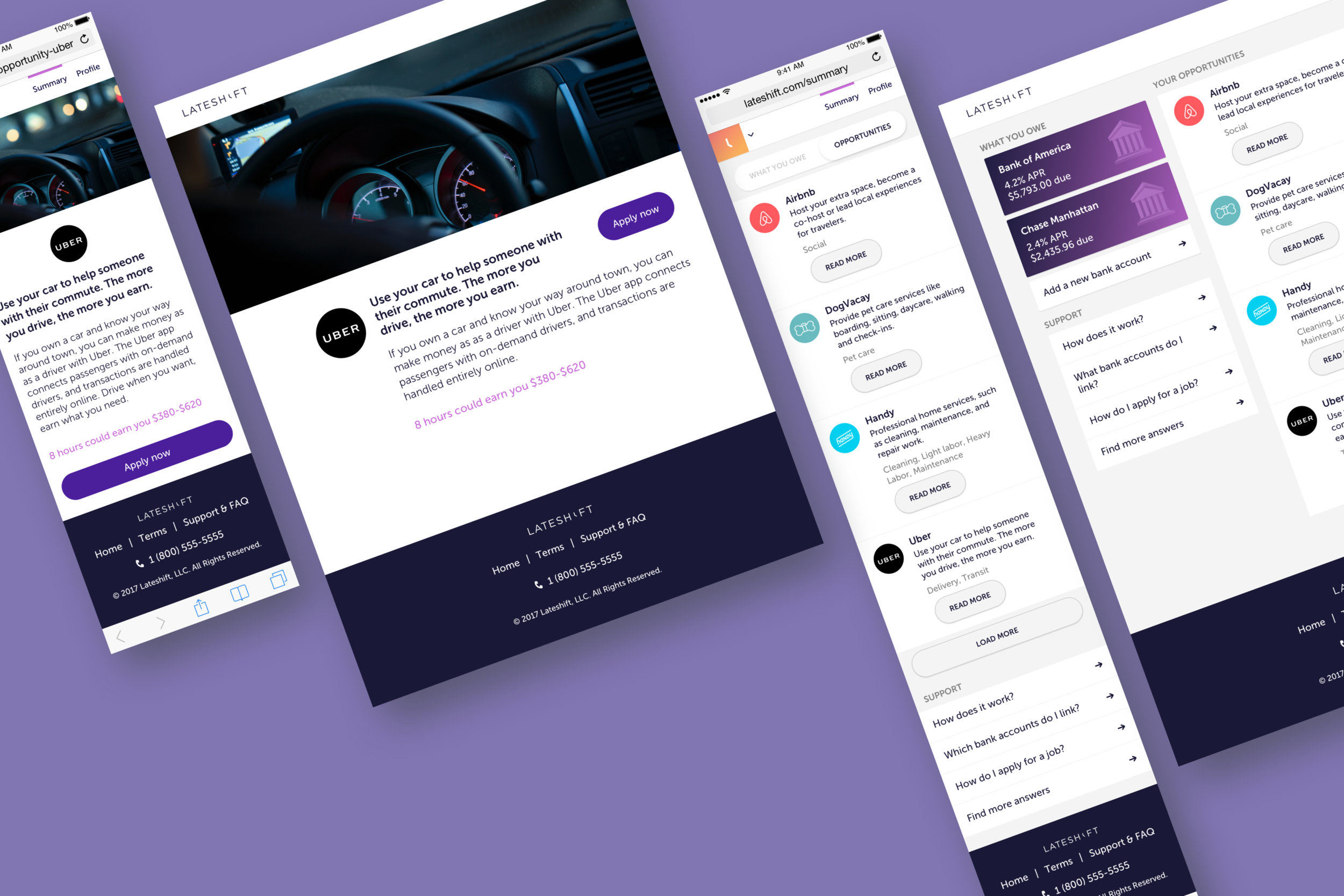
Lateshift
Role: UX/UI Design
Responsive Web and Email
Find opportunities to reduce debt


Sweet Defeat
Role: UX Design
Responsive Web
Stop sugar cravings one lozenge at a time


Thnks
Role: UX/UI Design
Native Apps and Responsive Web
Smarter business gifting


